Selective Color is a popular post-processing technique where the background is converted to greyscale, while key parts of the image are left in color. This is a great way to add some drama to your photos, and in this tutorial we’ll show you two techniques for selecting, or masking, the parts of the photo you want to highlight, and reducing the focus on the background. PaintShop Pro has several selection tools that make it easy to highlight just what you want. And there are many types of effects you can apply to the background, for varying degrees of muting or color.
In this tutorial, you’ll learn how to:
- Set up different backgrounds and apply muting effects
- Use selection tools such as Smart Selection Brush, Magic Wand, and Freehand Selection, to mask specific areas
- Adjust the background for various levels of saturation and color.
Love the selective color effect? You can get this look even faster using our collection of 5 scripts in the Selective Color script bundle – just one click and the script will apply the effect for you!
Thanks for watching! We hope you found this tutorial helpful and we would love to hear your feedback in the Comments section at the bottom of the page. You will find a written version of this tutorial below, and a printable PDF copy to download on the Download Resources tab above.
Tools You Need

PaintShop Pro 2022 Ultimate
Enjoy a faster, easier, more creative photo editing studio PLUS an exclusive bonus collection of premium software.

Sparkling Script
With this PaintShop Pro script you can add some pizzazz to your photos, in the form of random sparkles and glows based on the colors you choose.

PaintShop Pro 2022
Get all the color and brightness you’ve been missing with PaintShop Pro 2022, your all-in-one photo editing and design software.

Gradient Scripts
With this collection of PaintShop Pro scripts, you can instantly add colorful gradient effects to your photos. Choose from 10 different color schemes.
Using Selective Color to Add Impact to your Images
The perfect photo can be made even more impressive with selective color and a muted background. This tutorial demonstrates two techniques for selecting the parts of your photo that will remain in full color, while reducing the focus on the rest of the photo.
You’ll learn how to:
- Set up different backgrounds and apply muting effects
- Use selection tools such as Smart Selection Brush, Magic Wand, and Freehand Selection, to mask specific areas
- Adjust the background for various levels of saturation and color.
First, open your image in PaintShop Pro and make sure you are in the Edit workspace.

This is the photo that will be used in this example. We’ll create two new versions of this photo. Both versions will show the wedding couple highlighted in color, but each will have a different background.
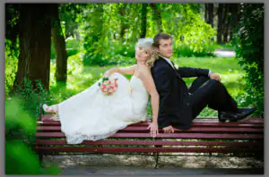
Before making any edits, it’s always recommended to duplicate the image and make your changes to the copy, rather than to the original image. In the Layers palette, right-click on the image and choose Duplicate. This places a copy of the image directly above the original. To change the layer name, click its title and enter a new name. This layer will be used as a black and white background, so I named it “Grayscale.”

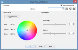
With the “Grayscale” layer active, choose Effects > Photo Effects > Black and White Film. You can adjust the brightness or clarity, or even add a mild filter color. If Preview on Image is checked, your image will update to show the effect.
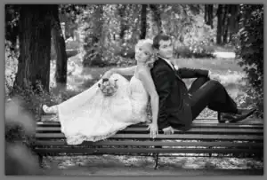
Here is our new grayscale layer:
Now say we also want to try out a sepia background. Create another duplicate of the original image and rename it.
To see this new layer, click the layer Visibility Toggle button  for the Grayscale layer, to turn it off.
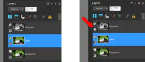
The Sepia layer has no effects added yet, so it still looks like the original photo.
There are sepia options in the Photo Effects menu, and also in the Instant Effects palette. You can open this by choosing Palettes > Instant Effects, or by pressing Shift + F2. Choose the effect you like, such as Sepia Medium Age, and double-click the effect thumbnail to apply it to the image.

Here’s the sepia layer, which will be our second option for the background.
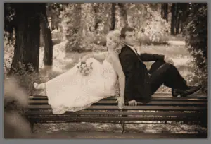
The next layer will contain the part of the photo we want to highlight: the wedding couple. Create one more duplicate of the original image, naming this one “Masked Color.” The new layer is placed directly above the original, and below both backgrounds. Because the Masked Color layer needs to be above its background, click and drag to move this layer to the top of the layer list.
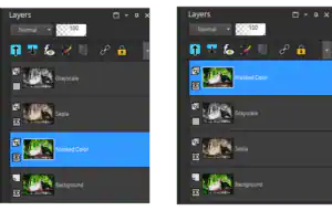
Now we can start selecting the parts of the photo that we’ll keep in this layer. Selecting is also called masking – think of masking as applying painter’s tape over areas you want to protect while painting.
A great tool for this is the Smart Selection Brush, part of the Selection tools flyout.
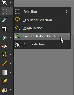
This tool identifies the color or colors where you click or drag the mouse, and selects an area containing similar colors. We’ll need to select multiple areas, so in the Interactive Property Bar, make sure the Mode is set to Add. This means each click will add to the selection. (You can also add to the selection by press the Shift key while clicking.)

You can set the brush size in the Interactive Property Bar or adjust it by holding the Alt key while dragging the mouse up or down. The Tolerance sets how closely the selected colors need to match.
This tool works either by clicking or dragging your mouse. In this example, clicking once on the groom’s shoulder automatically selects the groom’s entire dark suit. The moving dashed lines (also known as “marching ants”) shows the current selection. If your selected area doesn’t include enough of the photo, click different spots to select more areas one by one.
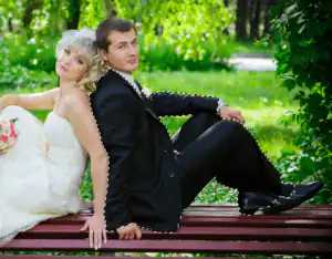
To select an area that contains multiple colors, try dragging the mouse. The bride’s entire dress, as well as arms and face, were selected after dragging along a curve from foot to head.

For the groom’s face, zoom in closely by scrolling up your mouse wheel. A smaller brush size works well here.

In this example, there’s a small area of hair that remains unselected.
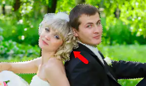
This would be easy to fix with the smart selection brush, but another option is the Freehand Selection tool. With this tool, you “rope off” an area by dragging the mouse to form a closed loop.
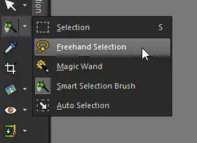
Make sure the mode is set to Add, then drag a loop around the area you want to select.

Everything inside the loop will be added to the selection.
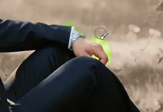
With Freehand Selection, and other selection tools, it’s possible to select more than you need. In this example, when trying to select just the groom’s hand . . .
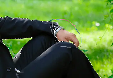
. . . a bit of the green background was added to the selection.
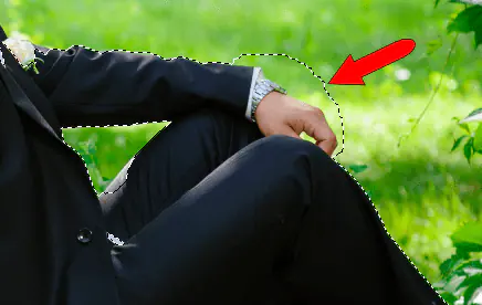
You could remove this area now, or just leave it and take care of it later, as we’ll see.
When all selections are added, the entire bride and groom, and only the bridge and groom, should be selected.
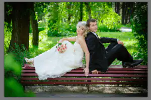
But the wedding couple is what we want to keep; the background is what we want to delete. To switch between what’s selected and what’s not selected, go to Selections > Invert. Now the entire background is selected.
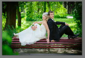
Press the Delete key to erase the selected background. And to clear the selection, press Ctrl + D (or go to Selections > Select None.)
Because the Sepia layer is below the current layer, and the Grayscale layer is still turned off, the sepia background is what shows through.
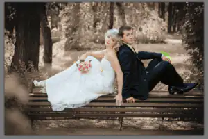
Now we can remove any bits of background that were included in the original selection. Choose the Eraser.
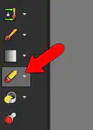
Adjust the brush size and sweep over what needs to be erased.
When you’re finished erasing, only the wedding couple should still appear in full color.
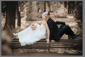
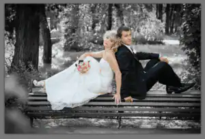
To try out the other background option, use the layer Visibility Toggle button  to turn off Sepia and turn on Grayscale.
Now the only hard part is deciding which photo you prefer.
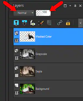
If the wedding couple in your final photo appears too bright, you can change the blend or opacity of the Masked Color layer. Choose a blend mode such as Soft Light from the Blend Mode dropdown, or lower the layer opacity by moving the slider in the Opacity window.
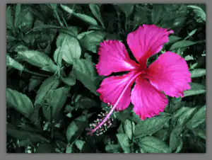
The second technique involves making all changes to a single layer, rather than using separate layers. Here’s the photo we’ll use to demonstrate this technique. The pink flower will remain in full color, and the rest of the photo will become a more muted background.
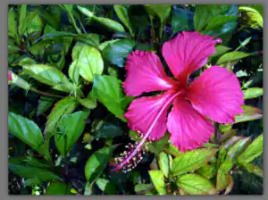
As always, make a duplicate of the original layer, and perform your edits on the new layer.
To mask the flower, choose a different Selection tool: Magic Wand.
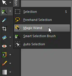
This is a one-click tool, which selects areas that match the color where you click. Make sure again that you’re in Add mode, and that the Match mode is set to Color. The tolerance can be adjusted to select areas of varying degree of similarity. And check Contiguous so that only areas attached to the flower will be selected. (Otherwise you’ll select some of the pink areas closer to the photo edges.)

Click anywhere on the flower, and contigous areas with similar color become selected.
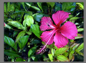
Continue selecting different parts of the flower until the entire flower is selected.
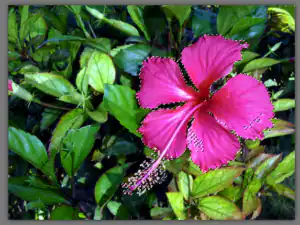
Small selection holes can be filled in with the Freehand Selection tool.
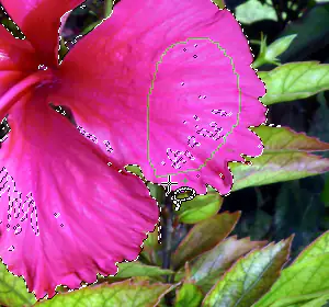
In this example, the area indicated below is part of the selection, though it should remain in the background. The Eraser won’t help in this case, because we’re not erasing the background (we’re adjusting the background).
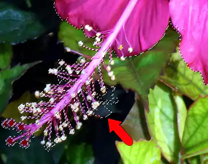
To remove this area with the Freehand Selection tool, you can change the mode to Remove, or keep the Ctrl key pressed, and carefully outline what should be removed.
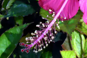
As before, since the flower is to remain as is, and the background needs to be adjusted, choose Selections > Invert to switch what’s selected.
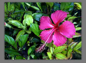
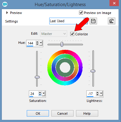
Now we can get to work on the background. There are many muting effects you can use; for this example, go to Adjust > Hue and Saturation > Hue/Saturation/Lightness.
Try lowering the Saturation to almost zero, which reduces the background to grayscale. Reducing the Lightness darkens the background.
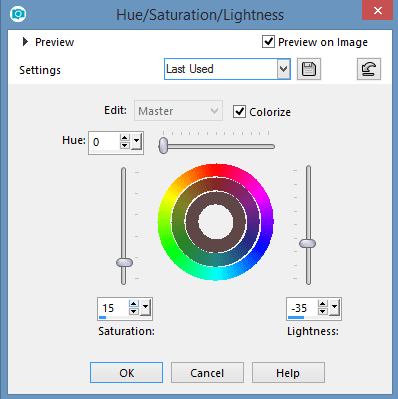
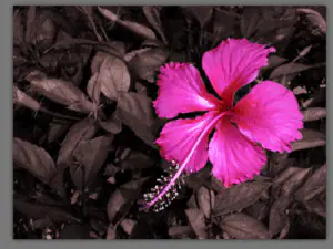
Or try bringing back some color by increasing the Saturation and adjust the Hue.
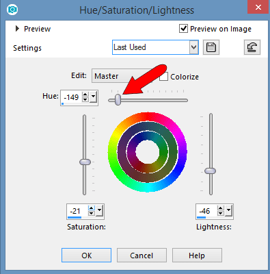
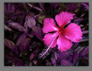
To apply a uniform color to the background, click Colorize.
See what’s new in PaintShop Pro 2022!
Download your FREE 30-day trial and get all the color and brightness you’ve been missing with PaintShop Pro 2022, your all-in-one photo editing and design software.