Thanks for watching! We hope you found this tutorial helpful and we would love to hear your feedback in the Comments section below. And don’t forget to visit our social media pages and show us what you’ve learned by sharing your photos, videos and creative projects with us.
Tools You Need

VideoStudio Pro 2022
VideoStudio Pro 2022 makes video editing easy, with hundreds of effects, templates, AR stickers, titles and transitions, plus new GIF Creator.

50 Cinematic LUTs
Instantly change the style and mood of your video projects with this pack of 50 cinematic quality LUTs for VideoStudio and Pinnacle Studio.

VideoStudio Ultimate 2022
Produce your best videos yet, with exclusive masking and color grading tools, premium effects, GIF creator and more in VideoStudio Ultimate 2022.

Light Leak Video Overlays
Add a subtle party vibe or artistic flair with these 6 eye-catching overlays of light and color, bringing life to any video project.
Color Grading Part 1 – The Basics
With VideoStudio Ultimate, you’ve got access to pro level color grading tools. Use the Auto Tone Adjustment, make manual adjustments to hue and exposure, control white balance and temperature on video clips, add LUT profiles or make more creative adjustments to radically change your footage – or even dive deeper with tone curves and HSL tuning.
1.Drag a couple of clips onto the timeline and double-click the clip, and then select color to get to the color properties. You can see you’ve got Basic, Tone Curve and HSL Tunings tabs. Each of these can affect the color of our clips in slight ways, use them individually or in combination with each other with some overlap in their features – you can use whichever you like, or a combination of all of them, if you want.
- Auto Tone Adjustment: The easiest, quickest feature is to use the Auto Tone Adjustment. This is a quick and dirty setting that lets VideoStudio analyse your clip for you, and give you its best guess. For example, it automatically will brighten a dark clip with a lot of shadows in the foreground. Use the dropdown to get brighter or darker auto adjustments.
- White Balance is basically how white white is in your clip. For example, in the morning whites will be slightly cooler with less reds, and in the evening it will be warmer with less blues and greens. Also, different cameras have slightly different color grades, so if you’re using a few different clips in your project you’ll want to balance your whites so that pure white looks the same across your clips
2. To White Balance your clips, double-click and get to color settings, and turn white balance on, and you can see its calculated like a grey color. Use the color picker to pick the white in your video and it will subtly changed the color of everything in the clip, making the skin tones look more real and vivid. There’s also quick options for things like cloudy, shade or fluorescent lighting etc.
3. Play with the other color controls
- Hue, which will make the image more green and magenta if you turn it down, or more yellow and blue if you turn it up – and by the way just double-click a slider to return it to 0.
- Exposure, which is kind of like the brightness of the clip
- Contrast, which kind of makes darks darker and light parts lighter, so kind of like controlling brightness in a different way, and then blacks, shadows, midrange etc which you’ll get into in more detail in the tone curve, as the tone curve has a similar control but in a different way.
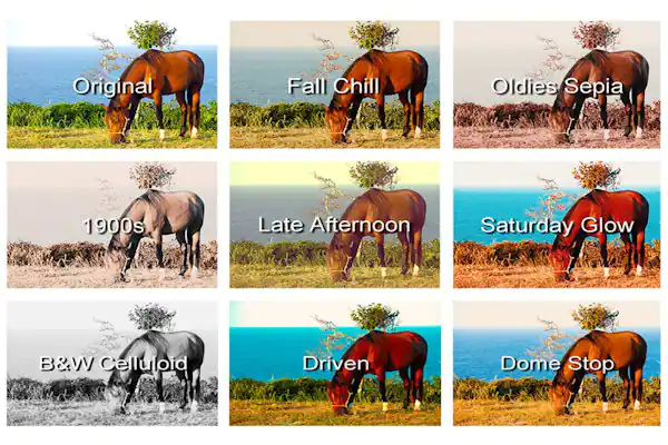
4. Finally on the basic tab you’ve got Look Up Profiles (LUT) – you can download LUTs from a bunch of different places on the web, these can be for advanced color correction or to apply kind of like filters that you might have in your phone or wherever. LUT’s are a quick way to make some really cool effects – you can use them in conjunction with the rest of the basic tab, or to apply the same filter to a bunch of different clips.
Color Grading Part 2 – Tone Curve
- Tone Curve controls the shadows, midtones and highlights separately from each other, and for different colors as well. With white selected here, the bottom left square is the shadows – in this clip that’s the foreground, the darkest parts of your clip, and then the next two squares are the midtones, which would be the parts in between the darkest and lightest which in this clip would be these misty mountains, and then highlights is the top right, square which controls the brightest parts of your clip which in this clip is clearly the sunset.
- You can adjust each of these parts separately via this diagonal line, which is flat by default, and if you click and drag towards the top left you’re making things brighter, and if you drag towards the bottom right, you’re making things darker.
- The Tone Curve comes into its own when you add more than one point though, so lets reset the midtones to neutral, and say you want the shadows to be a bit brighter you can drag it here, and you can see the foreground is getting brighter, or you can drag it the other way you can put the hill the subject is standing on into more of a silhouette – and you’ll notice as you’re doing this that you’re not affecting the brightness of the sun in the background, because you haven’t altered the top right square, which controls the highlights.
- Play with the midtones – if you drag towards the bottom right you can see the misty hills get darker and if you pull to the left they get a lot brighter – but you can see the tone curve is now definitely affecting the brightest part of the clip, the sun, so let’s add another point here to make the highlights back to normal again, and then get a little less extreme with the midtones.
- We can make simultaneous tone curves for each color of red, green and blue as well. Lets reset to see what you started with. This is where color correction can become really extreme, if that’s what you want to go for, or you can use much subtler corrections to just make your footage pop a bit – it’s an art that you’ll love getting used to.
Color Grading Part 3 – HSL Tuning
- Let’s look at HSL tuning. HSL means Hue, Saturation and Lightness, and each one can be adjusted independently from this dropdown menu. Hue is the color that is used, which is visualised by the sliders here – for example if you slide the yellow value to the left, our yellows will become more orange, and if you slide it to the right, the yellows become more green – as you can see in the color of the inflatable in the clip, here.
- Or you can use the click and drag – just select this tool, and then drag left or right on the color that you want to alter, directly on the clip itself. So if you do this on the yellow inflatable, you’ll see it’s mostly changing the yellow slider, but it’s also changing the green slider a little bit, as there is a tiny bit of green in the inflatable as well, but it’s only affecting those two colors and every other color in the clip is untouched. So you can use HSL to selectively target colors, maybe change the color of someone’s t-shirt or the sky or whatever you like.
- So that was changing hue, let’s drop down and select saturation – saturation is how vibrant a color is, or how far away it is from grey, which again is indicated by the sliders – turning a slider down makes that color more grey – so you can click and drag on the inflatable, to the left, it just drains the red until it’s basically a very light grey, and drag the other way and it’s like a more vivid, deeper, almost cartoon-like pinky red.
- Lightness is how much black or white there is in the color, which again is reflected in the sliders here – turn to the left to make the color darker – or turn to the right to make the color brighter. Let’s use this on the color of the water in this clip – in this case this adjusts both the green and cyan sliders, and you can make the water darker or brighter, depending on what you are going for.
See what’s new in VideoStudio 2022!
Download a FREE 30-day trial and dive into fun and easy video editing with hundreds of effects, slideshow templates, titles and transitions, plus new animated AR Stickers and GIF Creator.